Wednesday, July 14, 2010

A Different Perspective on Pet Photography by Jill Flynn

If you follow your pets around the house and outside, they will lead you to your next
memorable portrait. Always listen to your animals and take what they give you - it beats a posed shot any day. Whether it's natural light portraits, studio style portraits or outdoor portraits, find or create beautiful light and photograph your animals being themselves. Keeping it simple is sometimes the best idea.

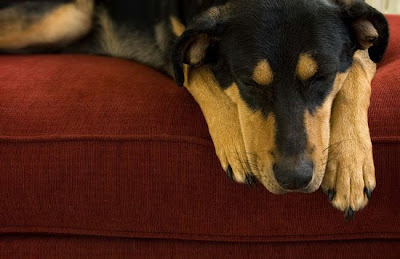
Photos of animals sleeping make wonderful portraits. I don't know any dog or cat that does not like to take a nap. If they have a favorite chair, couch, blanket, etc., position it in a room that has good light. A nice big window with diffused light at a 45-degree angle will illuminate your pet beautifully. Remember you want a room filled with beautiful light not direct sunlight. Patience is key, so keep your camera on hand and when your pet finally takes a nap, seize the moment. A splash of color can make a portrait pop. If you don't have colorful furniture, you can place a colorful blanket on top. My dog, Gracie, loves her afternoon siesta. I photographed her from a slightly high angle looking down so I could show her face being framed between her two paws and to accentuate the long, elegant lines of her nose and paws.


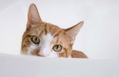
My cat, Murphy, likes to hang out in the bathtub. I don't know if it's because it's cooler in the tub or if it's because it's one of the few places Gracie doesn't hassle him ... maybe it's a little bit of both. Either way he loves the tub and looks so cute in there. Cats are always hanging out in unique places. Photograph your cat in their favorite spot. Bathrooms often have great light and a white tub will provide even more light. Many cats like to sit inside sinks. That is another great spot for a portrait. Get your pet to look at the camera, focus on the eyes, make it personal, and capture their personality. Make sure you illuminate the face with diffused light - that will bring out detail, color and give spark/life to the eyes. It will make all the difference in the world. Positioning your main light source at a 45-degree angle is a good start and will give you flattering results.


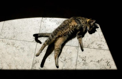
My cat, Mister, is a sun worshiper. He loves to bask in the sun. My kitchen gets bright afternoon sun and Mister is always there. Direct sunlight is not flattering light, but it will give you interesting shadows and contrasts. I love Mister's "three legged shadow" and face shadow. I also love the interplay of light and shadow on the tile. The strong contrast makes a visual impact and the window light provides very cool framing. Underexpose by 1 or 2 stops to make the shadows darker or play around with the exposure until you get the look you want. I stood on a chair and shot down so I could take in the whole scene. My cat "gave me this shot,"- thank goodness I was paying attention! Stand on a chair or ladder for unique perspectives and use the environment and shadows creatively to tell your story.


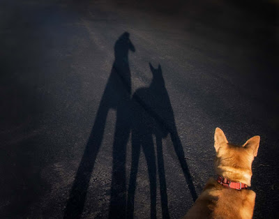
Next time you walk your dog, take your camera and be on the lookout for neat shadows. Shadows are longer late in the day or early in the morning when the sun is low in the sky. I took this picture of my dog, Friday, and me in the middle of the street. The light was behind us and I loved the way it illuminated Friday. Since it was late in the day, the light was warm and the shadows long. It was great. I showed just a portion of Friday's head in the lower portion of the frame to make it personal and add some color and fur. This is one of my favorite and last photos I took of Friday. She loved to go for walks. It will always have special meaning for me because it shows the bond we had and our daily ritual. She passed away a few weeks ago. She was 15 1/2 years old. I miss her dearly and I miss our walks. Try to capture the special relationship between you and your pet. Take pictures EVERY chance you get. They are ALL special. When taking shadow shots like this, underexpose by 1 stop or more to make the shadows darker and more defined. You can also enhance or give your image a boost with Levels and Curves adjustment in
PhotoShop. It's all part of the workflow and the creative process. I added a dark vignette around the edges to emphasize the shadows.


Take cues from your pets and capture those everyday moments. They end up being the most memorable and special portraits ... and always photograph what you love.

Jill Flynn
www.visualharmonyphotography.com

Jill teaches the following courses:
Pet Photography
Photography Adventure Course 2

Tuesday, July 13, 2010

Learning to see…

Learning to see creatively is very dependent on what your camera and lens can and cannot see. Captains of ships need to become very familiar with their maps as they navigate the world, making certain to keep the ship pointed in the right direction. In much the same way, your lenses are maps that can lead you to new and enchanting lands. With constant practice, which will only come by placing the camera and lens to your eye, you’ll begin to visually memorize the unique vision of each and every lens—both the pluses and the minuses. The more you do this, the less likely you’ll be hearing yourself ask the question, “what lens should I use?” You’ll learn just how vast an area a wide-angle lens can cover, or how a telephoto lens can select a single subject out of an otherwise busy and hectic scene. It won’t be too much longer until you’ll find yourself knowing, without hesitation, what lens to use as you see one picture-taking opportunity after another.

Then, you can begin to take this new found vision to even greater heights, challenging yourself to view the forest from a toad’s point of view, or the city streets from a sidewalk point of view, or your backyard from a robin’s-nest point of view. (Ladders are not just for house painting.) Lie on your back at the base of a large fir tree and show me the point of view of the squirrel that raced up it only moments ago. Set your camera on the shoulder of the road, and fire away just as the big semi truck comes into view. A composition like this will, for example, make it dramatically obvious why it is so important that the city council build a small underpass for the ducks that cross that same busy road every spring.

Whether or not your compositions are compelling depends not on some magic recipe, but rather on a thorough understanding of lens choice, point of view, elements of design, and final arrangement, or composition. All of these are, as I said, “maps” that require studying, some more then others. Both your fears and preconceived notions will be challenged. How will you ever share with others the robin’s-nest viewpoint if you’re afraid of heights? How will you share the busy sidewalk view if the idea of lying down on the sidewalk is too intimidating? You’ll certainly hit a “reef” now and then, and you may even feel compelled to abandon ship at times.

What If. . . ?

Once you begin making discoveries about how your lenses see, don’t be surprised if you find yourself at times consumed by the question “What if. . . ?” What if you focus close on your toaster that just burnt the toast and, as the blue smoke rises from inside, we see your wife—with the baby in her arms—out of focus in the background, running towards it? What if you focus on a passport lying on the sidewalk and we see an obvious out of focus businessman getting into a taxi in the background? What if you focus on a bottle of sleeping pills with an out of focus woman asleep in her bed in the background? What if from inside the house or garage, you focus close on a broken window-pane with an out of focus solemn-looking little boy, glove and bat in hand, in the yard in the background? What if you focus on just the thumb of a hitchhiker on a busy interstate? What if you focus close on just the used syringe in an alleyway? What if you focused close just on the. . . ?

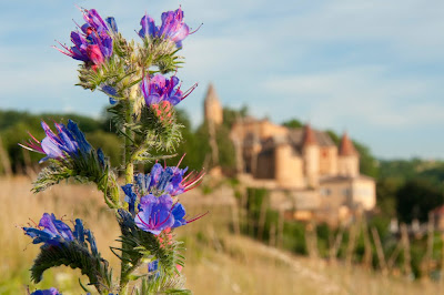
Our desire to see objects up close is innate- a longing for intimate encounters perhaps. And when we combine an up close and personal view of a given subject, we can in turn control the subjects “visual weight” via the proper selection in aperture. It is the aperture in combination with the close focus that determines the overall sharpness in a given scene. And in both of the finished examples shown here, focusing close and the use of a large lens opening, f/5.6, emphasizes the foreground flowers, and in turn the background is rendered into out of focus shapes and tones. It’s as if the flowers have been given a voice, a voice that says quite simply, “Look where I get to bloom!”

The very small village of Jarnioux, France is listed as one France’s Most Beautiful Villages and for good reason. I have shot in Jarnioux more then a dozen times, during all seasons and I never ceased to be amazed at making new discoveries here. As we can see in the first example, the village boasts an old church and castle, and along it’s nearby fields and roadside ditches one can often find wildflowers blooming in the spring and summer. After shooting the first image:


Nikon D300S-Nikkor 28-70mm F/5.6 @ a 1/800 second, 200 ISO

The thought then occurred to me, “What if I could show the village of Jarnioux from the flowers perspective, as if the flowers wanted everyone to know where they lived?” With the aid of my Nikkor 28-70mm f/2.8 lens I was able to move in really close to a single flower stalk and when combined with a large lens opening, I was able to give the flowers a voice.


Nikon D300S-Nikkor 28-70mm F/5.6 @ a 1/800 second, 200 ISO

As this second photograph shows, it’s as if the flowers are now exclaiming, “Look where I get to bloom!”

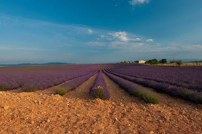
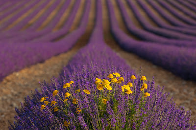
The Valensole Plain in Provence France is a lavender shooters paradise. Once you drive up on any number of small roads that lead to the top of the plain, you will be greeted with waves of lavender as far as the eye can see. It’s an area that is truly hard to take a bad picture! However, having shot ‘waves of lavender’ many times already, I was once again looking for something new. It was then I spotted these yellow flowers in a large expansive field of lavender.


Nikon D300S, Nikkor 70-300mm ED-IF VR, f/5.6 @ 1/1000 second, ISO 200

I new I could once again place the visual weight on these flowers and render the waves of lavender as out of focus shapes and tones in the background. Again, I was able to give the flowers a voice.


Nikon D300S, Nikkor 70-300mm ED-IF VR, f/5.6 @ 1/1000 second, ISO 200

As the second photograph clearly shows, “Look where we get to bloom!”

Get to know your lenses and their unique visions and instead of asking what lens should I use, you will soon be asking “what if…”

Friday, July 9, 2010

MAKING A SPLASH

A tip from PPSOP instructor David Nightingale

One of the hardest photographic lessons to learn is that your camera sees things differently to you. For example, when you shoot a backlit portrait and rely on your camera's meter to determine the exposure, you will often find that you end up with a shot where your subject is too dark and the background is too bright. The problem here is that our ability to perceive dynamic range - the ratio between the darkest and lightest areas of a scene, or 'contrast ratio' - far exceeds the sensitivity of our camera's sensor, i.e. it's just not capable of recording detail in both the brightest AND darkest areas simultaneously. In these circumstances then, we have three choices. First, we can wait for better light, or move our subject into the shade. Second, we can artificially lower the contrast ratio between our subject and background by adding some light using fill-flash or a reflector. Both of these methods will reduce the contrast ratio between your subject and the background, allowing you to record detail in both areas of the image. Third, rather than relying on your metered exposure you can take a meter reading from your subject rather than the scene as a whole. This will lighten your subject, but will probably blow out at least some of the details in the background. Whichever of these methods you use, you can guarantee that it will produce a better image than the metered exposure.

In the example we're going to discuss in this week's tip though we have the opposite problem, i.e. the contrast ratio between the darkest and lightest areas of the original scene is quite low. If you take a look at the original image (a shot of a waterfall at the Dubai International Financial Centre) you will see what I mean - it's a rather dull, flat shot.


If we take a look at the histogram we can see why: the majority of the tones are bunched just to the left of the middle. In other words, we have lots of fairly dark mid-tone values but relatively few bright highlights or deep shadow detail.


In this case then my perception of the scene - as a bright, dynamic composition - is at odds with the reality that my camera's sensor recorded: the contrast ratio was lower than it appeared. Again, there are a variety of solutions. I could have waited for better light, or added some directional strobe light, but I also knew that this would be really easy to adjust during post-production, i.e. by using a couple of relatively straightforward techniques I would be able to produce a much more striking image.

So, let's take a look at the three, relatively straightforward changes that were made to this image during post-production.

Before we do though, if you'd like to take a more detailed look at the various adjustments that were made to this image, you can download a copy of the PSD file (1.5MB) here:

http://www.chromasia.com/.../ppsop_tip_mas.psd.zip

CROP AND ROTATION
The first change I made, as you can see below, was to flip the image horizontally, rotate it 90 degrees clockwise, and then crop the image to 16x9 aspect ratio. None of these changes were strictly necessary, but I decided that I was going to aim for a fairly abstract image from the outset; one that would really emphasise the interplay between the brightest and darkest areas of the image.


INCREASING THE CONTRAST

If you have already downloaded and opened the PSD file you will have noticed that this image was adjusted using just three curves. The first two - Curves 1 and Curves 2 - were used to add a dramatic increase in contrast.

Curves 1
As you can see from the image below Curves 1 is a strong S-Curve (a term that is used to describe this shape of curve) that significantly brightens the highlights and deepens the shadows. In other words, it increases the contrast ratio between the brightest and darkest areas.


Curves 2
Curves 2 is also an S-Curve, and again, it brightens the highlights and deepens the shadows.


If you've familiar with the Curves Tool in Photoshop you may be wondering why I used two Curves when I could probably have just used a stronger S-Curve from the outset, i.e. one adjustment layer rather than two. The reason, in this instance, is that it's often quite difficult to get exactly the right tonal balance when you've making a very large change in contrast, i.e. moving any of the control points on a single curve can have quite a profound effect on the appearance of the final image. If you use two curves, on the other hand, it's often much easier to fine tune the effect and get exactly the right balance of tones.

The net result of these changes, as you can see below, is that the image is now considerably more interesting: the detail within the stream of water is now much more pronounced, and the image as a whole appears to have more depth.


At this stage, I could have stopped - the image is a big improvement on the original - but I decided to accentuate the almost abstract nature of the image by toning it.

TONING THE IMAGE

There are a whole variety of tools and techniques you can use to tone an image, but in this instance I used another Curve, as illustrated below.


In this instance, rather than altering the RGB composite curve, I altered both the Green and Blue curves (to do this you just need to select one of the individual channels using the drop-down menu towards the top-left of the Curves dialog).

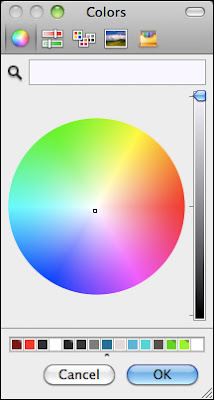
The change to the blue curve is probably self-explanatory; by adding a control point to the middle of this curve, and dragging the line to the left, I added some blue to the midtones. By contrast, by adding a control point to the green curve and dragging the line to the right, I removed some green from the midtones. While it's easy to imagine the effect that adding blue will have - the image will be more blue - it's a bit harder to visualize what effect removing a colour will have. What does less green look like? There is an easier way to think about this though, i.e. when you lower the amount of a specific colour within an image you proportionally increase the amount of it's complimentary colour. If you're unfamiliar with this term, take a look at the screen grab below.


If you look around the border of the image in a clockwise direction, starting on the right, you will see that red fades into magenta which then fades into blue, then cyan, the green, yellow, and then back to red. So, the primary colours - red, green and blue - are separated by the secondary colours; magenta, cyan, and yellow. To find a complementary colour, just look to the opposite side of the colour wheel. For green then, the complementary colour is magenta, so by using a curve to lower the amount of green in the mid-tones I added magenta. By the same token, had I wanted to add a cyan cast to the image, I could have dragged the red curve to the right.


SUMMARY
As I hope the above has demonstrated, creating a striking and dynamic image from a rather dull, flat original is relatively straightforward; often requiring no more than two or three simple steps.

FURTHER READING

If you‚ are interested in exploring any of these techniques in more depth, take a look at my online Photoshop tutorials. The two that you'll find especially useful are linked below.

Tonal Range and the Curves tool: this tutorial provides an in-depth discussion of the Curves tool (this is a free tutorial).

Toning Color Images: this tutorial discusses a variety of tools and techniques you can employ to tone your colour images; including the Channel Mixer, the Selective Color tool and the Curves tool. (available to our annual subscribers and lifetime members).

Saturday, July 3, 2010

Back Lighting Foods and Liquids

Translucent foods and liquids are ideal candidates for backlighting. You can really show off colors and patterns with your light shining directly through your subject. It is critical that your light source be intense enough and your subject translucent enough to make this work. If you are using fruits and vegetables as a subject, be sure to slice them thin enough to let plenty of light through. If you are shooting liquids, pick something that is fairly light in color. It's much more difficult to get light to penetrate red wine than white wine or dark beers like porter and stout than something like pale ale.

The setup is pretty simple and just about any strobe, hot light, speedlite, or even natural light will work. A softbox will make a great light source for backlighting fairly thin foods and light colored liquids as well as providing a nice high key background. A diffusion panel will also work as will a thin piece of white Plexiglas. You can place a very large reflector on your strobe, point it straight up and set a piece of Plexiglas on it to make a "light table". You can get thin sheets of Plexi in different colors to make some interesting backgrounds as well. Another alternative is an actual light table or slide viewing box. Colored gels can be placed on these for different background colors.

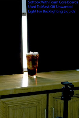
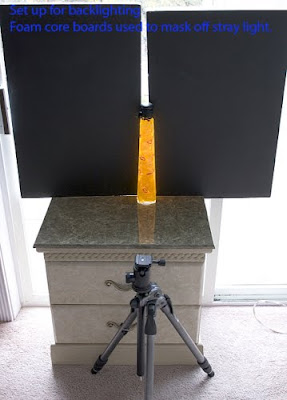
Whenever you are shooting towards your light source, you need to watch out for lens flare so a lens hood is definitely required and you can even use your hand or a small flag to block any additional unwanted light from hitting the front lens element. Additionally, masking off your light source so that you are only allowing light through your subject and not around it will also really help avoid flare and increase contrast. Black foam core works great for this. Here are a couple of very easy to set up backlighting sources that will work for many subjects. The first one is a softbox with foam core blocking all but a strip of light and the second is a large window with direct sunlight coming through. Again, foam core is used to block out unwanted light from hitting the front element of the lens.


Canon 90mm TS-E w/36mm extension tube


This setup works equally well as long as you have a large enough window with direct sunlight coming through it. Only a thin strip of light is needed to fully illuminate the subject. You really have to be careful when shooting directly into sunlight this bright. Make sure that you don't let any light past the subject or you could hurt your eyes.


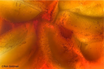
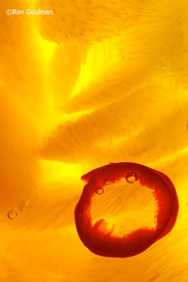
Canon 180mm macro, f/8, 1/40sec

It takes a lot of light to shine through a subject this dense and the direct sunlight works perfectly. Using a macro lens, I was able to completely fill the frame with the subject.

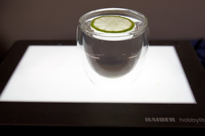
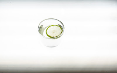
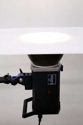
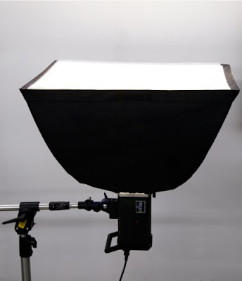
Another method that works great if you have the ability to shoot straight down on your subject is to simply place it directly on a backlit surface. You can make your own light table very easily out of a softbox, strobe w/reflector, or continuous light and piece of Plexiglas if you don't have any other options available. I have used all of the following methods and they all work equally well. You do need to be careful that your working surface is sturdy enough to hold up your subject.


Light box used for backlighting.


Fluorescent studio light with white plexi used for backlighting.


Strobe w/7" reflector and white plexi for backlighting.


Strobe with softbox and white plexi used for backlighting.

All of these lights/setups are suitable for creating beautiful backlit images. The following are some examples of what can be done. There are hundreds of other subjects that will work equally as well.


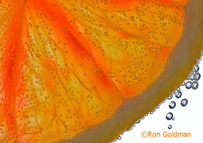
Canon 28-70mm w/20mm extension tube, f/11, 1/2sec

Orange slice in sparkling water, sitting on a light box. The light coming past the orange makes a nice high key background.


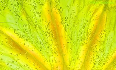
Canon 28-70mm w/20mm extension tube, f/11, 1/3sec

Switched out the orange slice for a lime and placed a green gel under the glass for color.


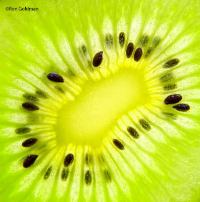
Canon 28-70mm w/36mm extension tube, f/5.6, 1/30sec

Thin slice of Kiwi placed directly on light box. The extension tube allowed me to move in close enough to fill the frame.

To learn more about this and other food photography techniques, check out the following classes at PPSOP.com

Introduction to Food Photography Food Photography 201 - Recipes for Success


Ron Goldman
PPSOP Instructor